
A strong brand identity should help people recognize your business, understand what you stand for, and trust the quality behind your name. But even a successful identity can lose relevance over time.
That does not always mean you need a complete rebrand. In many cases, the smarter solution is a focused refresh: preserve the equity you have built, refine the elements that no longer serve you, and create a more consistent visual system for where your business is today.
For marketing professionals, this distinction matters. A brand refresh is not simply a new logo or a more contemporary color palette. It is an opportunity to bring your visual identity back into alignment with your strategic vision, mission, and audience.
Here are five signs it may be time to take a closer look.
1. YOUR VISUAL IDENTITY FEELS STUCK IN THE PAST
Design standards evolve. Digital formats change. Businesses mature. If your logo, typography, color palette, or imagery have remained untouched for years, they may no longer communicate the quality and relevance of your organization.
This does not mean an older identity is automatically ineffective. Longevity can be an asset. Familiarity builds recognition, and recognizable brand elements carry real equity. The question is whether your current identity still feels intentional and distinctive: or whether it looks like a snapshot of an earlier chapter.
You may be ready for a refresh if:
- Your logo becomes difficult to read at smaller sizes.
- Your typography feels dated or lacks flexibility.
- Your colors do not reproduce consistently across print and digital applications.
- Your website, presentations, or printed materials look less polished than the work they represent.
- Your team hesitates to use older brand assets because they feel out of step.
A thoughtful brand identity design process can address these issues without erasing what people already know. A logo design company with experience in identity systems will look at proportion, spacing, typography, color relationships, and usage: not just whether a mark looks current.
The goal is not to chase trends. It is to make the identity feel clear, confident, and equipped for the next stage of the business.

2. YOUR BUSINESS HAS EVOLVED, BUT YOUR BRAND HASN’T
Businesses change. You may have expanded your services, entered a new market, developed a more specialized point of view, or grown from a founder-led venture into an established organization.
When the visual identity still reflects the company you were several years ago, a disconnect can develop. The brand may communicate a smaller offering, an outdated audience, or a less mature level of expertise than the business now provides.
Before touching the design, we begin by asking questions:
- What is your organization known for today?
- What do you want to be known for next?
- Which parts of your mission have remained constant?
- What has changed in your audience, capabilities, or strategic vision?
- Which existing brand elements still feel unmistakably yours?
This before process is essential. Smart design is our promise to never design in a vacuum. At Roycroft Design, we take time to understand your story and direction before putting pen to paper. That context allows us to distinguish between brand equity worth protecting and visual habits that are simply holding the identity back.
A refresh should make your evolution visible. It should help the design carry the weight of the business you have become.
3. YOUR BRAND LOOKS DIFFERENT EVERYWHERE
Inconsistent design is one of the clearest signs that an identity system needs attention.
Your primary logo may appear in several slightly different forms. One department may use a different blue from another. Presentations may rely on fonts that do not appear anywhere else. Event materials may look polished on their own but disconnected from the rest of the organization.
Over time, these small differences create a larger problem: people have a harder time recognizing the brand.
A strong identity is more than a logo file. It is a system that defines how the logo, typography, color, imagery, layout, and supporting graphics work together. That system should be flexible enough for a range of applications while remaining recognizable from one touchpoint to the next.
A brand identity refresh may include:
- Refining the primary logo and creating clear alternate formats.
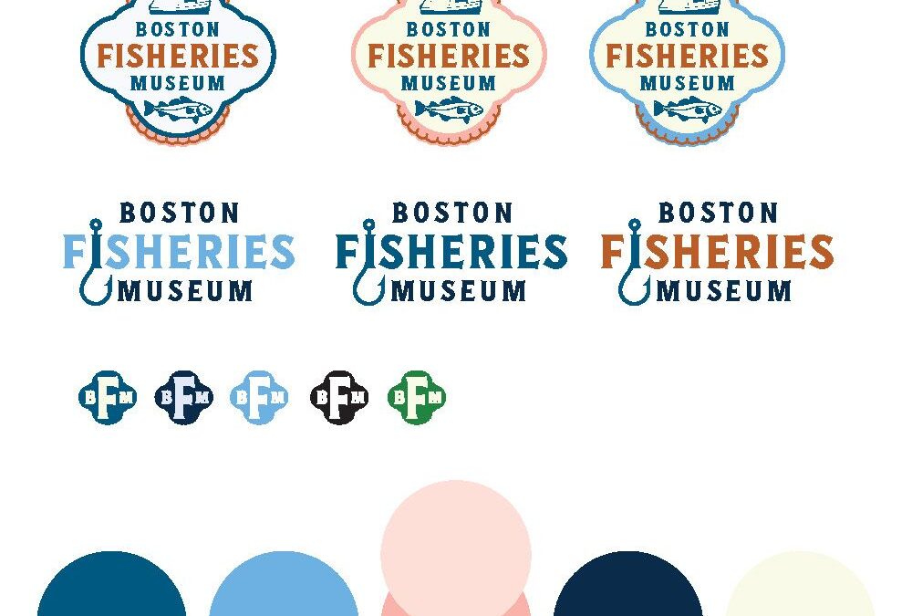
- Establishing a responsive logo system for different sizes and applications.
- Clarifying color specifications for print, screen, signage, and apparel.
- Selecting type styles that create a consistent hierarchy.
- Defining image treatments, graphic devices, and layout principles.
- Updating brand guidelines so internal teams and outside partners can use the identity with confidence.
The best guidelines are useful, not restrictive. They give your team enough structure to make consistent decisions while leaving room for creativity and context.

4. YOUR LOGO WORKS IN ONE PLACE: AND NOWHERE ELSE
A logo that looks fine on a website may fail on a presentation cover, embroidered shirt, street banner, social profile, or environmental sign. That is not necessarily a problem with the mark itself. It may be a sign that the identity was never developed as a complete logo system.
Consider the full range of places your logo needs to work:
- Large-scale signage
- Business cards and stationery
- Digital presentations
- Mobile screens
- Social profile images
- Event materials
- Apparel and merchandise
- Packaging or printed collateral
- Co-branded applications
A refresh gives you the opportunity to test the existing logo under real conditions. Sometimes the solution is a subtle refinement to letterforms or spacing. Sometimes you need a simplified icon, a horizontal lockup, a stacked version, or a one-color treatment.
This is where choosing the right logo design company matters. The craft is not limited to drawing a symbol. It involves creating a family of marks that holds together across formats, preserves recognition, and supports the broader identity.
If your team keeps improvising logo variations, the issue is probably not a lack of effort. The system may simply need to be designed.
5. YOUR BRAND NO LONGER FEELS LIKE YOU
This may be the most important sign of all.
You know your organization has a clear mission and a meaningful story, but the visual identity does not express it. The colors feel generic. The typography lacks personality. The imagery does not reflect the people or communities you serve. The overall impression may be polished, yet somehow disconnected.
That feeling is worth taking seriously.
Design should create a visible connection between what an organization believes and how it presents itself. A thoughtful refresh looks for the details that can make that connection stronger: a more appropriate type style, a distinctive color relationship, a clearer visual hierarchy, or a graphic element rooted in the organization’s history.
The work should feel like an honest evolution: not a costume.
HOW TO REFRESH YOUR BRAND WITHOUT STARTING OVER
A successful refresh typically follows a deliberate sequence.
START WITH AN IDENTITY AUDIT
Gather the materials your audience and team encounter most often: logo files, presentations, stationery, event collateral, signage, website pages, and internal templates.
Review what is working and what is not. Look for repetition, inconsistency, weak applications, and opportunities to strengthen recognition. Do not evaluate each piece in isolation. Look at how the pieces behave together as one identity.
PROTECT YOUR BRAND EQUITY
Identify the elements people already recognize. This may be your name, logo silhouette, color family, signature type treatment, or a particular graphic motif.
Preserving these elements can make the transition more intuitive. Recognition does not need to be sacrificed for refinement.
DEFINE THE DESIGN DIRECTION
Before developing concepts, agree on what the refreshed identity should communicate. Should it feel more established, more approachable, more refined, more energetic, or more flexible?
This is where your strategic vision and mission guide the creative work. The design direction should be specific enough to support decisions, but open enough to allow for discovery.
BUILD THE SYSTEM, NOT JUST THE HERO PIECE
A refreshed logo is only one part of the solution. Develop the supporting elements that make the identity usable: type hierarchy, color standards, graphic assets, image direction, templates, and application examples.
This holistic approach is what turns a logo update into durable brand identity design.
ROLL IT OUT WITH ACCOUNTABILITY
Introduce the refreshed identity in a practical order. Start with the most visible and frequently used materials, then update secondary applications. Provide organized files and clear guidelines so your team is not left guessing.
A small, nimble design team can make this process especially manageable. You work directly with the people shaping the identity, rather than navigating layers of account management and production handoffs. That direct connection reduces anonymity, increases accountability, and helps keep deliverables consistent.
A REFRESH SHOULD MOVE THE BRAND FORWARD
Your brand has already done important work. It has earned recognition, built trust, and created a foundation for growth. Refreshing it should respect that history while giving the identity more clarity, flexibility, and relevance.
At Roycroft Design, we bring more than 30 years of proven expertise to that process. Since opening our doors in 2003, we have helped new ventures, growing businesses, and Fortune 500 companies create design systems that are strategic, cohesive, and built to last.
We are a small team, but we pack a big punch. Our collaborative and holistic approach means we take the time to understand your mission before developing the visual solution. Our full range of design services supports your identity as it grows: from brand and event projects to the materials that bring the system to life.
If your brand feels dated, fragmented, or disconnected from the organization you are today, it may not need a clean slate. It may need a smarter next step.
Meet the Roycroft Design team to learn how we can be of service.
Recent Comments