
Fall gala season is here. For nonprofit development and events teams, that means the pressure is on to create an experience that feels meaningful, polished, and worthy of your donors’ attention.
The strongest events begin long before guests arrive. They begin with a clear visual strategy.
Event branding design is not simply the creation of a beautiful invitation or a memorable event logo. It is the disciplined process of translating your mission, milestone, and audience into a cohesive visual story that works across print, digital, and environmental touchpoints.
When every detail works together, your gala feels intentional. Donors understand what the event represents, why it matters, and how they fit into the larger story.
Here are 10 event branding design details to prioritize as you prepare for fall and spring gala season.
1. START WITH THE MISSION, NOT THE MOOD BOARD
Before choosing colors, type styles, or imagery, define what the event needs to communicate.
Is the gala celebrating a major institutional milestone? Is it introducing a new initiative? Is it honoring the people who have helped your organization grow? Each purpose calls for a different visual approach.
This “before” process is essential. We take time to understand a client’s mission, strategic vision, history, and audience before beginning execution. That discovery informs every design decision that follows.
Smart design is our promise to never design in a vacuum.
A gala identity should feel distinctive, but it should never feel disconnected from the organization behind it.
2. BUILD A DISTINCTIVE EVENT IDENTITY
A recurring gala may benefit from a recognizable visual identity that evolves over time. A milestone event may call for a more specific, celebratory system. Either way, the event needs a strong foundation.
That foundation can include:
- A custom event name treatment or wordmark
- A complementary color palette
- Coordinated type styles
- A graphic motif or pattern
- A defined image direction
- Simple rules for layout and hierarchy
The goal is not to create a collection of unrelated pieces. The goal is to establish a visual system that can be applied consistently and flexibly.
A successful event identity should be recognizable on an invitation, legible on a screen, and clear from across a room.
3. MAKE THE INVITATION DO STRATEGIC WORK
The invitation is often the first physical expression of the gala. It sets expectations for the evening and signals the importance of the occasion.
Consider the full invitation experience, not just the front panel. The format, paper, typography, folds, envelope, reply card, and supporting inserts all contribute to how the event is perceived.
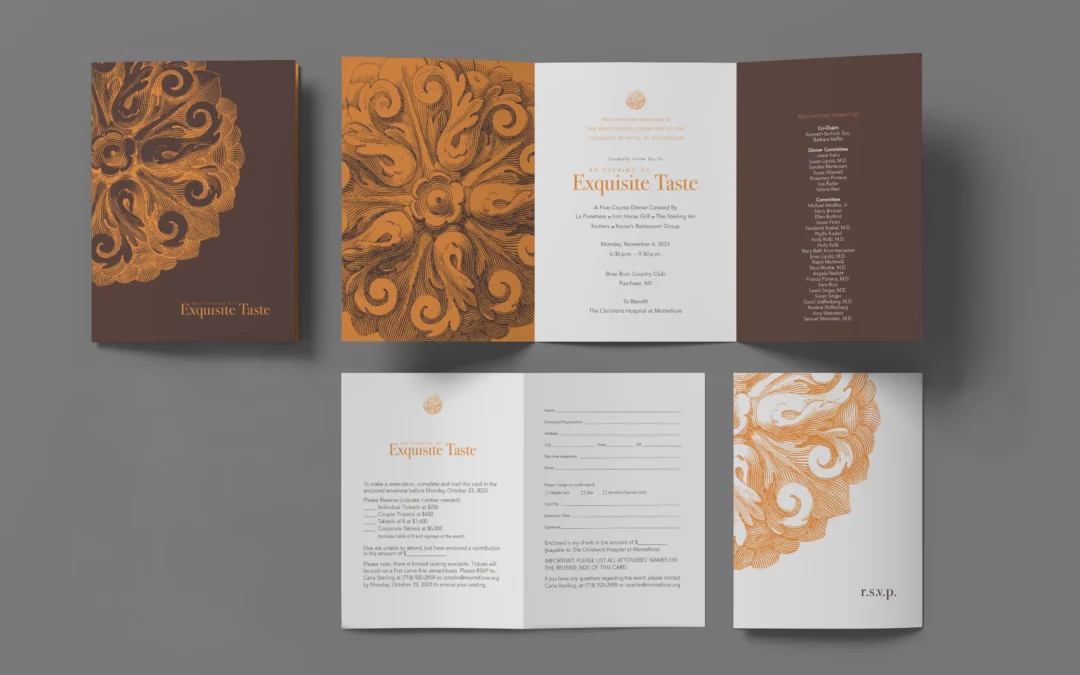
For An Evening of Exquisite Taste, Roycroft Design created a comprehensive gala suite for The Children’s Hospital at Montefiore, including a custom trifold invitation, RSVP card, and matching stationery. The rich chocolate and burnt orange palette, combined with classical scrollwork, established a sophisticated visual language across the suite.
That cohesion is the point. The invitation should not merely announce the event. It should begin the experience.
4. DESIGN FOR THE SIGNIFICANCE OF THE MOMENT
Milestone events require thoughtful visual interpretation.
For the Beth Israel Deaconess Hospital-Needham 13th Annual Gala, the design needed to acknowledge a 100-year milestone while remaining elegant and current. The resulting invitation and collateral used a considered palette and clean typography to communicate both heritage and forward momentum.
Anniversary design should not rely on a date alone. The visual story should help audiences understand what the milestone means.
What has changed over the past century? What has remained constant? What does the organization’s history make possible next?
When those questions shape the design, the anniversary becomes more than a decorative theme. It becomes a meaningful part of the event identity.

5. CREATE A VISUAL LANGUAGE THAT CAN TRAVEL
An event identity should be designed for real-world use.
That means considering how the system will translate across:
- Printed invitations and programs
- Digital save-the-dates and event graphics
- Registration and confirmation materials
- Presentation slides and screens
- Menus, table numbers, and place cards
- Directional signage and welcome displays
- Sponsor recognition
- Post-event thank-you materials
For Literary Lights 2026, designed for the Associates of the Boston Public Library, a stained-glass-inspired motif creates a distinctive and flexible visual language. The suite brings together a poster, bookmark, save-the-date card, digital social post, and branded tote bag.
Each piece has its own function. Together, they feel like one event.

6. USE TYPE TO GUIDE ATTENTION
Typography is one of the most important tools in event branding design because it controls both tone and information hierarchy.
A gala invitation may need to balance the event name, honoree, date, location, dress code, registration details, and sponsor information. If all of those elements compete equally, the design becomes difficult to navigate.
A strong typographic system establishes order:
- The event name receives immediate attention
- Supporting information is easy to scan
- Important calls to action are visible
- Secondary details remain accessible without overwhelming the composition
Type also communicates character. Refined serif styles may support a sense of heritage or ceremony. A clean sans serif may feel more contemporary and direct. The best choice depends on the organization’s identity and the event’s purpose.
The right type styles make the information feel confident, not crowded.
7. DESIGN FOR MORE THAN ONE FORMAT
Today’s event materials often need to work in both physical and digital environments. That does not mean simply resizing one design for every channel.
Print has different requirements than a mobile screen. A folded invitation can create anticipation through sequence and texture. A digital invitation must communicate quickly and remain legible at a smaller scale.
The Massachusetts Girls in Trades project demonstrates the value of designing a coordinated system across formats. Roycroft Design created a multichannel campaign for the nonprofit’s job fairs, including printed materials and digital applications.
The project’s bold blue and yellow identity remains clear across touchpoints while supporting the organization’s purpose: encouraging attendance and opening pathways into construction trades.
You can explore the Massachusetts Girls in Trades project for a closer look at how one visual system can support multiple formats.

8. PLAN THE ROOM AS PART OF THE BRAND
The event does not stop at the invitation.
When guests arrive, the visual identity should continue through the environment. Welcome signage, registration materials, table numbers, menus, stage graphics, sponsor displays, and wayfinding all contribute to the experience.
This is where a holistic approach matters. Environmental pieces should not be designed as last-minute additions. They should be considered alongside the invitation and other core materials so that colors, type styles, motifs, and spacing remain consistent.
The result is a room that feels connected rather than decorated.
A cohesive environment helps guests understand where to go, what to notice, and how the evening fits together. Good design can provide that structure quietly, without competing with the people and stories at the center of the event.
9. GIVE PRINT COLLATERAL A CLEAR ROLE
Programs and event booklets do more than list a schedule. They can introduce an honoree, explain the organization’s impact, establish context, and give guests a tangible reminder of the evening.
The Judgment of Paris event booklet uses a rustic wood background, laurel wreath graphic, wine imagery, and a strong “1976” reference to convey heritage and celebration. The visual direction supports the event’s subject while giving the booklet a distinct point of view.
The lesson is not that every gala needs a heavily themed booklet. It is that print collateral should have a reason to exist.
When a piece carries useful information and reinforces the event identity, it becomes part of the experience rather than an item guests simply set aside.

10. EXTEND THE IDENTITY AFTER THE EVENT
The final event detail is what happens after the room clears.
A thoughtfully designed gala identity can continue through thank-you cards, impact summaries, donor updates, digital recap materials, and follow-up collateral. Using the same visual language helps connect the generosity of the evening with the work it supports.
This does not mean repeating the invitation indefinitely. It means preserving the visual connection so the event feels like part of an ongoing relationship.
For development teams, that continuity is valuable. Donors should be able to recognize the event, remember the experience, and understand the impact that followed.
CONSISTENCY IS THE STRATEGY
The best event branding design does not ask one invitation to carry the entire burden. It builds a connected system in which every piece has a role.
Your event identity should help donors notice the invitation, understand the occasion, navigate the evening, recognize the organization’s values, and remember why their support matters.
That takes more than a quick theme or a collection of decorative assets. It takes strategic thinking before execution, careful attention to detail, and a willingness to see the gala as one complete visual story.
At Roycroft Design, our collaborative and holistic approach is built around that process. With 30+ years of proven expertise, we help organizations turn their mission into smart, consistent design across print, digital, and environmental touchpoints.
We are a small, nimble team, but we pack a big punch. You work directly with a design partner who understands your vision, stays accountable to the details, and delivers a consistent experience without the anonymity or inconsistency often associated with larger agencies.
Event branding design is our promise to make every touchpoint work harder for the story you are telling.
To see how our full-service design studio can be of service for your next gala or milestone event, explore our design services or say hello.
Recent Comments